Label Designs
After completing the packaging designs, I moved on to the label designs. Initially, I focused on the same style, to retain continuity. This first design uses a common label style, with a convex arc at the top mirroring the arc of the bottle. However, in print this design was too large and cumbersome for an already bottom heavy bottle. The design features the coloured illustration, again, the colour assigned by its age. On the front label, this is placed similarly to the box designs, whereas, on the back, two layers of the pattern are combined to give a full background and border for the text heavy design.
After experimenting with the previously bulky design, a much narrower square label was created, to slim down the bottle and provide a sleek appearance. This shape modernises the bottle, matching it more closely to the tall box design. On the back label, the full border was narrowed to a top and bottom border, giving more height to the label whilst retaining space for the type.
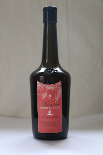
At this point, another design was experimented with, using a concave arc to highlight the glass stamp on the bottle. This combines the narrow shape of the previous design and the more interesting arc of the first design. However, as the bottle is a dark green glass, the white of the label appears very stark and isn't complimentary to the bottle.
Therefore, keeping the same shape and design, the final label design was created by inverting the colours. Now each individual bottle is more distinctive with their signature colour the bulk of the background of the labels. To contrast the coloured backgrounds, the illustration and logo were adjusted to white. The darker tones match better with the bottle colour and also contrast nicely when placed alongside the box designs, providing variation.


Comments
Post a Comment