Baskerville Body Copy
Introduction:
Baskerville is a transitional typeface developed in the
early age of typography. It is known for its high contrast forms and finer
serifs, with both positive and negative responses, garnering it a controversial
type at the time of release. Designed by John Baskerville, it embodies his
desire for proportion and a softer yet geometric edge. It is most commonly used
as body copy for its larger x-height and higher readability, noticeably on the
Kindle Paper white and in literature including The Holy Bible, James Joyce’s
Ulysees and Milton’s Paradise lost. But is also a strong competitor in display
types also seen in Hollywood and logo designs. The type remains as a popular
book face with its suitability anchored in its legibility and beauty giving any
work an air of elegance and debonair.
History:
Baskerville dates back as far as 1754 and was the work of printer
John Baskerville. Baskerville, at the time a servant, was a keen calligrapher
and was recognised for his penmanship by his master, who then sent him to
develop his talent. He was passionate about his calligraphy and despite being
illiterate spent time practicing his strokes. Baskerville formed his typeface
as a reaction to the mathematical style of the popular Romain du Roi developed
by Phillipe Grandjean for Louis XIV, which he believed was cold and too
angular. In contrast, Baskerville used the humanist Caslon typeface as
inspiration due to its higher contrast strokes and geometric letterforms.
To achieved his desired style of typeface, he was required
to invent his own method of printing. Experimenting with printing technology at
the time, he developed his method of boiling fine linseed oil to a certain
thickness, dissolving the rosin, letting it subside and then finally grind
before use. This resulted in an intense black ink that he could use on bright
woven paper to achieve his contrasting strokes. He also redesigned the existing
printing presses, replacing the wooden platen with brass to allow the planes to
meet evenly. This combined with the intense ink captured the subtleties of his
type and his high contrast letterforms.
“Having been an early admirer of the beauty of letter, I
became insensibly desirous of contributing to the perfection of them. I formed to
myself ideas of greater accuracy than had yet appeared, and had endeavoured to
produce a set of types according to what I conceived to be their true
proportion.” John Baskerville, preface to Milton 1758 (Anatomy of a typeface)
It is said that Benjamin Franklin was an admirer of
Baskerville and used a sample of his typeface as the basis for the typefaces
that occupied the U.S. Federal Government papers. His work was originally commissioned
and to be used in the classic works for Cambridge University press, most
notably the 1757 edition of The Holy Bible, regarded as his most characteristic
specimen.
Despite this, Baskerville received little popularity with
critics arguing blaming Baskerville of “blinding all the readers of the Nation;
for the Strokes of [his] letters, being too thin and narrow, hurt the eye”. His
widow released the Baskerville punches and matrixes to Europe where it made a
large impact after being circulated among foundries.
The type was also revived in the 20th Century by
American Typographer Bruce Rogers, who upon discovering a type specimen of
Baskerville in a Cambridge bookstore in 1917, recommended the type for the
Harvard University Press. Baskerville also inspired both Didot and Bodoni as
the admiration for his high contrast typeface spread to France and Italy.
Anatomy:
Baskerville is a Transitional Serif typeface. These
Typefaces have higher contrast to previous humanist styles and a more vertical
stress. This stress axis can also vary between characters. They have a more
regular shape and proportion with relatively even x and cap heights. The
apertures are slightly smaller and the terminals have bulbous rounded shapes.
Like the humanist typefaces, they still have gradual bracketed
transitions from the stem.
Uses in the Media:
Baskerville was originally commissioned by Cambridge
University for their print works, the most notable result being their 1757
edition of The Holy Bible. Known as his most renowned work, the piece evokes
his style and character, considered his finest achievement in his lifetime. He
also printed Milton’s Paradise Lost in 1758, and then reprinted the book in
1759 and 1760.
In present day, his work can be seen in film, particularly
in the poster campaign for the 2007 film American Gangster, embodying the suave
nature of the men in suits that also occupy the poster. The high contrast
characters are bold and crisp presented in white on a black background.
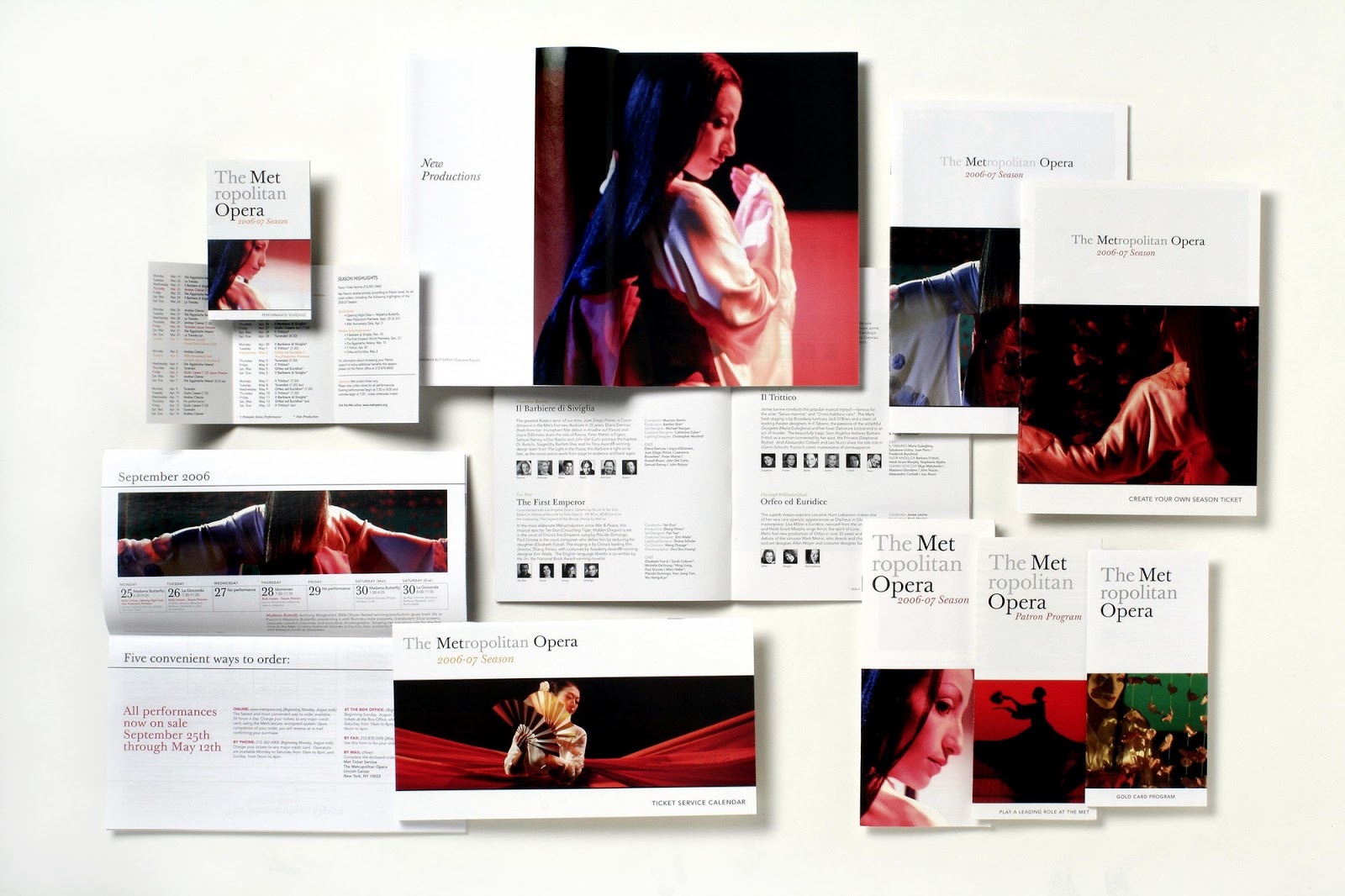
It has also been used as the primary typeface in the new identity
and rebranding of the New York Metropolitan Opera, since 2006. The logo
features purely the typeface in a grey and black colour scheme with no other
decoration, placing the character of the typeface at the forefront of the
design.


Comments
Post a Comment