Poster Text Mock-ups
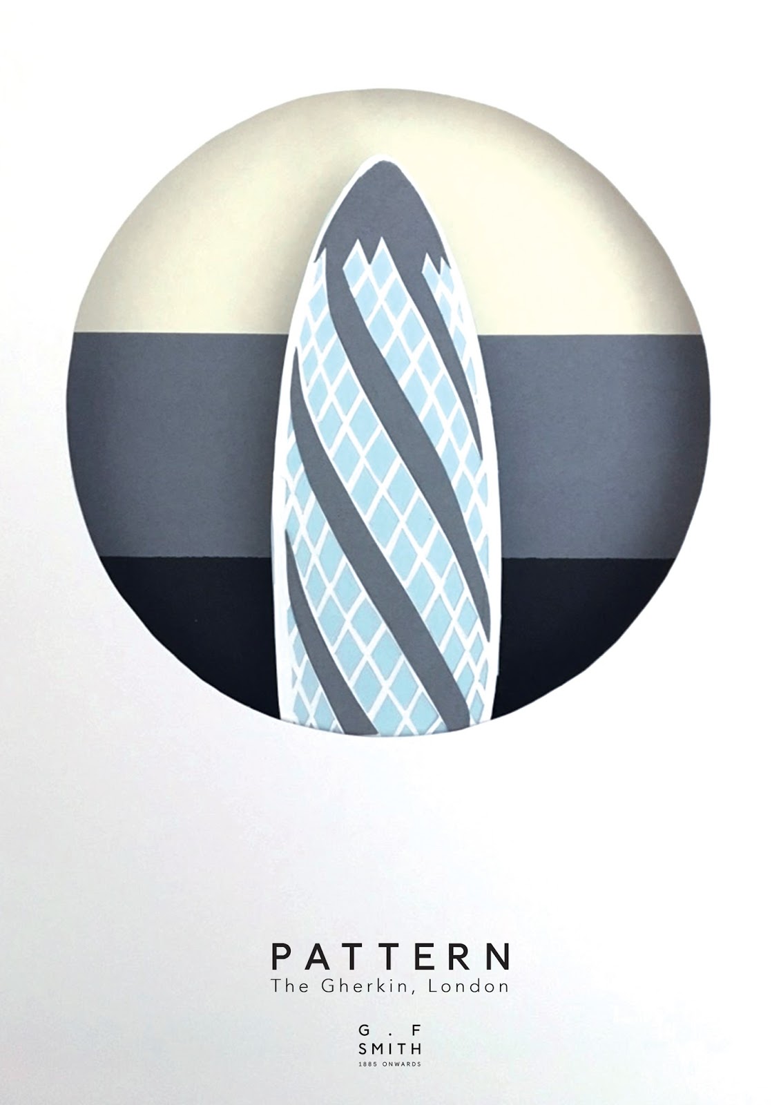
For the next stage of the design, I needed to add the information on the poster, specifically, G.F. Smith's logo, the design element/principle and the landmark's name and location. I wanted the text to have the smallest impact possible on the design, so as not to distract from the design. Therefore, I cycled through multiple layouts before selecting one that was discreet but still readable for the audience. I chose to use a centred design with justified text to match the G.F. Smith logo, keeping the house style of the brand. I mixed the G.F. Smith typeface, recreated using the pen tool in Illustrator, with the Avenir typeface due to its light stroke and rounded sans serif characters.


Comments
Post a Comment