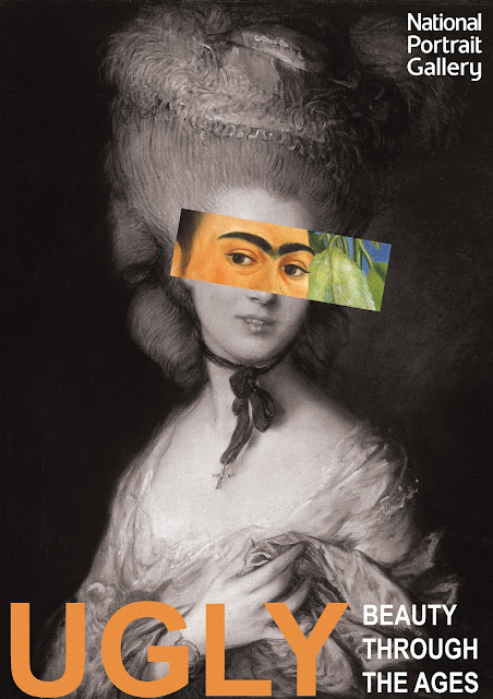
Juxtaposition Posters
In this lesson, we experimented with juxtaposition and the use of contrast in graphic design. We were tasked to design posters for the National Portrait Gallery for the exhibit 'Ugly: Beauty through the ages'. For these designs, I focused on the use of painted portraits rather than photography, to connect with the National Portrait Gallery. I wanted to use contrast to make the audience question the title 'Ugly' and what or if anything is being considered ugly in the poster.
To do this, I juxtaposed the statuesque image of the royal portraits with brighter and more exotic portraits. By de-saturating the background portraits and keeping the colour in the foreground images, the contrast raises questions. Are the realist paintings more beautiful than the colourful works of post-impressionism and symbolism? To emphasise the title, 'ugly' I used the ink dropper tool to select a colour from the foreground images, creating a cohesive design.


Comments
Post a Comment